Title: RePrinted Politics
size: 60cm X 69cm
month of completion:October
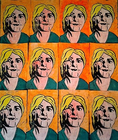
exhibition text:This is a piece done using the block printing process followed by colouring it in and was influenced by the current elections and the repetitive work that Andy Warhol did to showcase industrialization. It was intended to show how politicians are often the same as their predecessors and was intended to make the statement that politicians because they are so similar cannot represent change.
size: 60cm X 69cm
month of completion:October
exhibition text:This is a piece done using the block printing process followed by colouring it in and was influenced by the current elections and the repetitive work that Andy Warhol did to showcase industrialization. It was intended to show how politicians are often the same as their predecessors and was intended to make the statement that politicians because they are so similar cannot represent change.
|
|
Process:
I'm not the best at drawing so I had to practice how to best draw her. Before drawing it on the print to avoid erasing an the print, it wouldn't have really effected the process but it would have bothered me. Despite this i did end up redoing the face before i carved that portion because it wasn't at all recognizable. Carving prints is something you think is mindless before you go into it and then you remember that you need to push hard enough to remove it from the print and not stab yourself in the process. When carving the background I used a wider tool to remove more at once and make the process go faster, but I still had to go slowly because its really easy to carve all the way through a print on accident, which I only ended up doing once on this piece. The smaller tool was used to get close to lines that had to be positive space because I could have a higher accuracy when using it. Actually printing the piece you need to be careful during because you have to avoid touching to much of the print because if ink gets on your fingers it'll get on your piece and then you have to start over. So its best to be careful in the beginning. So the printing process goes like this: |
1.) Scoop out a little bit of ink (you don't wanna waste it) and put it on to the metal sheet.
2.) Use the roller to spread the ink across the sheet evenly, then using the sheet coat the roller with the ink. they kinda happen at the same time.
3.) Roll the ink off of the roller onto your print. do it more then once because you want all of the print to have ink on it.
4.) Place the paper you are printing onto on top of the now inked print. then you rub the paper down onto the print, make sure you press firmly and evenly otherwise you can end up with really spotty prints.
5.) When you pull the paper off of the print you have to do it slowly to make sure the ink stays on the right side and then you just leave it to dry.
Journal writings:
When making this piece my skills at carving and printing improved sense the last time I did a block print. I ended up with smother lines and more detail then the block print I made last year. My drawing skills still are not the best but because Block prints are high contrast black/white works that helps combat my low skill level and it creates semi-recognizable figures. One thing I forgot this time was the holders that we have to keep the print from moving and to help you not stab yourself so next time I should definitely use one of those. Also if I were to do this again I would project the image onto the print rather than drawing it freehand. I make the mistake of free-handing things often and it lowers the quality of my work.
I chose to use block printing because I knew it was a high contrast process that could be done repeatedly and that would help me mimic Andy Warhol's style. I chose to use Andy Warhol as my inspiration because a lot of his work was focused on how industrialization took the individuality out of things and it was all about mass production. Because what I was trying to say had a similar meaning I chose to use his work. With this Piece I was trying to say how similar politicians are and that regardless of who they are they are often configurations of former politicians.
although the block printing process is difficult I've improved in it from last year and even throughout this piece, this year I found out that you can make two prints on one piece of paper. During this piece the moat difficult part was colouring them. I decided they had to be coloured in to better imitate Warhol's style, but that wasn't the best idea. colouring in each one with pencil lead to inconsistency in how dark or light colours where as well as how close colours would get to the ink, sometimes the ink would even mix in with the colours if I'd got to close. After I had coloured in the hair body and background I decided to just paint the shirt because I didn't have the right coloured pencil to make a similar colour, I turns out I should have done this from the start, when using paint it allowed for solid colours and it could be rubbed off of the ink with out effecting the piece allowing for the colour to fill in all available area.
One thing that bothered me through out the piece was weather or not I should use an even number of rows (4X4) and end up with a rectangle like Warhol did or if I should use a 4X3 and have a shape closer to a square. In the end I decided to have the uneven numbered rows but that was just something that frustrated me.
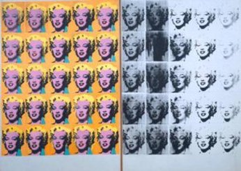 Warhol, A. (n.d.). Marilyn Diptych [Digital image]. Retrieved September 30, 2016, from https://arthistoryoftheday.wordpress.com/2011/08/16/andy-warhol-marilyn-diptych-1962/
The piece it was based on was the left side of Warhols Marilyn diptych. I think it turned out okay in emulating the style through out the peice I tried to copy the colours used,there are two differences that really stand out to me between the pieces. In warhols the hair isn't entirely blocked off like i did in mine, although this is a failure in emulating his style I believe that if I had not separated the colours with the block print that larger differences within all of the prints would have been prevalent. The other major difference is that my piece had part of her torso showing in Warhol its just the neck up, because of this i used the colour that he had used by Marilyn neck to colour in her blazer. Two smaler things I should fix is that In warhols peice he added colour for her lips and eye shadow where as I had left her face as one colour additionally I think that I should have used a stronger colored pink, because I was colouring lightly with a red and when the rest of the piece was done with high pressure It makes the skin look very pale and off setting given how bright everything else is.
ACT Questions:
1.) Because it was based off of Andy's Marilyn diptych that lead to me using the block printing method. The inspiration also made me use the colours that i did to copy the scheme in the piece.
2.)
3.)The general meaning of Andy's work was on mass production and the effects of industrialization. Most of his works were on political/social statements and in general delt with the loss of individualism.
4.)The central idea was on how industrialization was taking away individuality because mass production lead to things being the same, he presents a bit of satire in his work by mimicking the mass production.
5.)
