|
Title: Bright Light
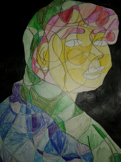
Size: 15.24 cm X 30.48 Medium: couloured pencil and paint on paper Month of completion: December Exhibition text: This peice was done based off of the Girl with the peral earring by Vermeer and a work by local artist Baylor. It was an attempt at mixing the vacant girl with a pearl earring with a very colourful orgainc work of Baylor. This work was done using coloured pencil for the face to create the brightness of Baylors work, but given a dark background that i did with paint to aluded to Vermeers work which the peices positioning was based off of. |
|
|
I began this process by griding out the photo I wanted to use,I took a photo to mimic the positioning of Vermeer's Girl With a Pearl earring. After I had grided the photo, I filled in the area with organic shapes that divided the piece into smaller sections, I used this to divide the different shades although the colours are divided off of the lines of the body. i painted the background black based on Vermeer work, this choice made the colours used stand out and gave the work a depth. .I outlined all of the lines that went through a section to help me differentiate on where to colour. Despite this i still ended up colouring a block in the yellow section with one of the pink tones. If I where to do this again a would base where lighter and darker tones went to create the depth that Vermeer had in his work. Additionally alto of the sections i made where to large but when i had realized this i was already half way done with colouring and decided to leave the lines spaced as they were that way I wouldn't effect the flow and movement of the piece. I deliberately left the eyes and lips blank because in Vermeer work i feel as though the woman pictured has very vacant eyes and did not know how to portray that through
|
retrived from, Welcome. (n.d.). Retrieved December 11, 2016, from http://www.reginaldbaylorstudio.com/reginald-baylor-new-home-page
|
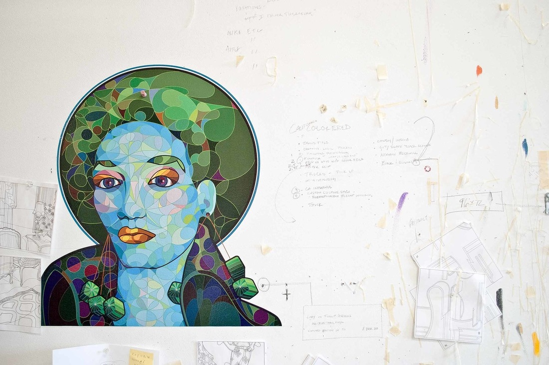
Insperation: I based the peice off of a peice by Baylor and a peice of Vermeers.
Baylors influnces can be seen in the style of the peice, Because of his peice I made organic outlines across the peice and then filling in each section with different tones of similar colours. Baylors work is also the reason that I used such bright colours, such as using shades of yellow for the skin similarly to the way Baylor used blue.. Vermeer influnce is seen primarily in the positioning of the subject and the outfitting. |
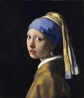
Janson, J. (n.d.). Girl with a Pearl Earring. Retrieved December 13, 2016, from http://www.essentialvermeer.com/catalogue/girl_with_a_pearl_earring.html
|
Reflection: I feel that I should have incorporated more of Vermeer's influence into the piece, although the influence can be seen its not that clear. The effect of Baylors work created a very interesting effect, but I believe that I should have created smaller sections and used the different shades to create the high contrast shadows that Vermeer had in his work. Over all I like the way the piece looks, although I could have done better on the colouring, but what this piece need is a higher meaning because as it is right now it's only technical.
