|
Title: Know differnce.
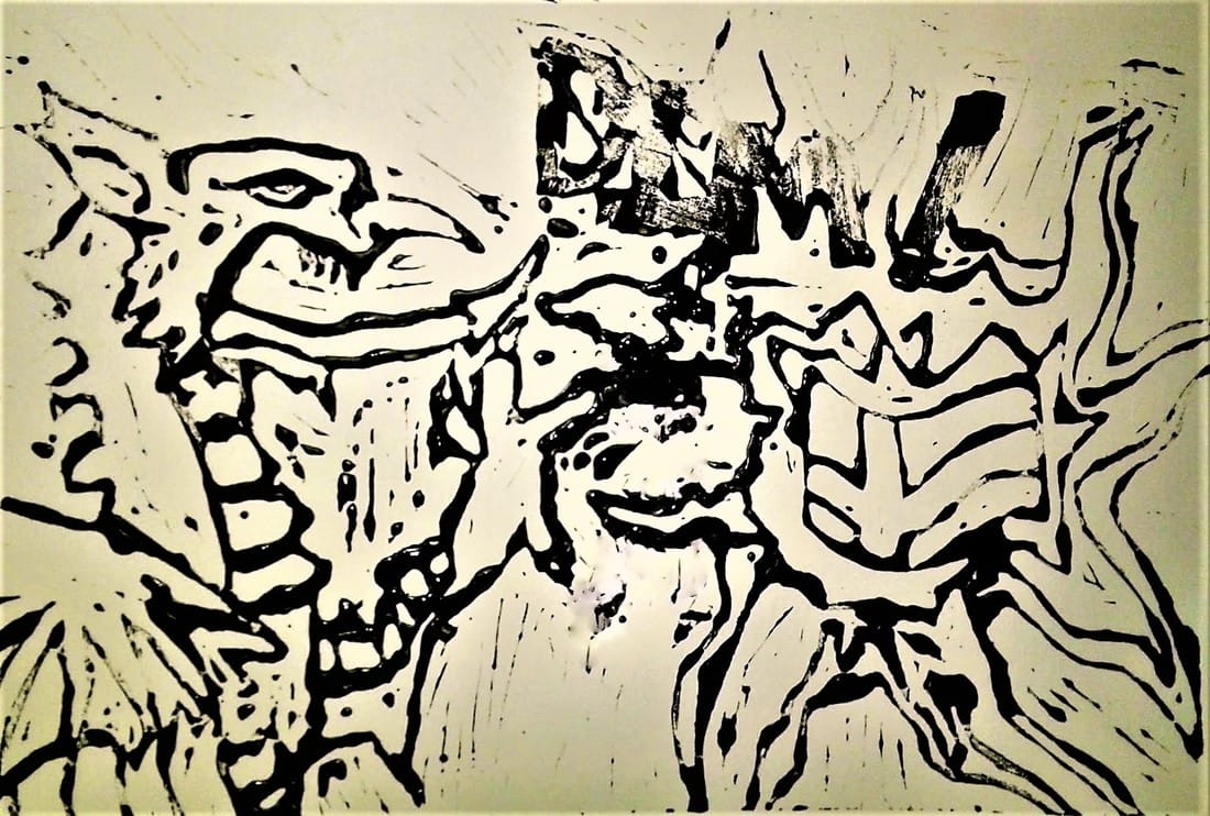
Size: 23Cm x 15.1 Cm Medium: block print Month of completion: decmber Exhibition text: This peice was based off of Roy Lichtensteins whaam!. it portrays the welsh dragon and the english flag in place of the planes of Lichtensteins Peice. This was done as a block print. The peice is intended to portray that welsh and english culture are two different things dispite being from similar areas. This lead to the title "Know differnce" suggesting that one should know the differnce between the two cultures. |
|
This process was something I was already familiar with but I attempted something different with this medium. Block prints are generally used for printing large spaces of colour, but in this one I attempted to create a more detailed work. This made the process more difficult, When carving block prints in the past I was able to cut through large spaces of it at one time but due to the detailed lines in the work I was trying to create I had to spend more time on carving. Also doing this piece with the medium of block print, i had to deal with the limitations of not having thin tools to fit into smaller areas. Aside from dealing with the thin lines it followed the regular printing technique when after carving I spread ink over the print, placed a paper on top, and applied pressure to transfer the ink onto it. Another thing that I experimented on in this piece was using words on it, when block printing, words will appear backwards so i had to practice writing Dim backwards using a mirror until I was confident that I could do this with out having to erase on the print, which is something i dislike doing because I get confused by half erased lines and often fill in the wrong space if they are there.
|
|
Meaning: This piece is focused on wales and England, because although they are different cultures they are often consider similar by people from outside those areas. additionally conflicts can occur ocationly between the two. Where Lichtenstein had used the word wham I chose the welsh word that means no, highlighting that they are not the same.. Lichtenstein piece had a plane exploding, I did not want the piece to have that form of violence in it as although the cultures are different they don't need to have animosity. For that reason I left the flag of England Unscathed in the flames.
|
|
Inspiration: This piece was based off of Lichtenstein's Whaam! His piece shows a violent conflict and although that is not the goal of my piece I Mimicked his positioning. I placed The welsh dragon, using the design of the welsh flag, in the place of the firing plane. I followed Lichtensteins use of the word whaam with the word dim. his influence can also be seen in the multi layer design of the fire.
|
Reflection: I think that in this peice I actually developed my skills in block printing as I got better carving more detailed peices, dispite my developement I don't think that the print turned out as well as it should have because the ink ended up spreading and created a large black spot under the flames and the lettering although, it ended up facing the right direction which is a victory, was not very defined. Additionally I think that I should have based this work off of a less violent work as the overall meaning has no place with violence. Dispite this because I enjoy the design of this print and have developed my carving skills I still consider this peice a suecess.
